Summary
A user’s filter selections and the filters applied at the report level (not visible to the user) can be computed via DAX functions and then exposed to client applications. This practice can increase the usability and adoption of Power BI and SQL Server Analysis Services Tabular-based reports and dashboards – particularly complex reports with many filtering options. The method described in this post provides an intuitive and dynamic answer to “What’s this report filtered by?”
Background
Although you can filter Power BI report visuals via selecting and drilling through other visuals on a report page, ‘slicers’ or visually interactive filtering objects are still a necessity in most contexts to give users a simple, flexible way of controlling filter context at the report page level. (The same goes for Excel reports though in Excel you ‘can’ use a slicer to filter a separate page/sheet – hopefully this is something Power BI will support as well)
Users like the control slicers provide but they don’t want to hunt with their eyes across the screen or click and scroll through slicers to know or check the filter context. They want to know ‘at a glance’ what they’re looking at and they want confidence that they’re not misunderstanding the report. Beyond adoption/usability issues, in a worse-case scenario the wrong business decision is made or the wrong conclusion is reached based on a misunderstanding of what’s filtered.
*When the feedback is “this report is too busy” and you can’t remove or consolidate any metrics then some targeted messaging may help simplify.
Technical Implementation
Three components:
- ISFILTERED on the attribute being filtered on the report
- FILTERS wrapped inside of a CONCATENATEX to provide the string of dimension members being filtered
- A nested IF expression based on components 1 and 2 to provide the text message
The DAX:
- Produce a TRUE() or FALSE() condition if the column is directly filtered
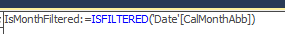
*It’s extremely important in this post and in general with DAX to distinguish between a direct filter on a column and ‘what’s left’ after crossfiltering has been applied to the column from other others. Check out ISCROSSFILTERED for more detail on this alternative.
- Produce a string of the filtered values

The FILTERS function doesn’t get much attention in common DAX/Power BI/SSAS Tab books or blogs. This is probably because it’s only useful or necessary ‘after the fact’ of filtering in scenarios like this. That said, I don’t believe this is by any means some niche or exotic ‘nice to have’ feature. Additionally, I’m not aware of any upcoming feature in Power BI or SSAS that would expose the currently filtered values/members to client tools.
Note that you could use VALUES() instead of FILTERS above if the intention is to show what values that remain ‘active’ after all other filters have been applied. In some cases this might actually be the way to go (‘these are the ‘X’ items left) but it’s outside the scope of this post.
The CONCATENATEX is new for SSAS 2016, Power Pivot for Excel 2016, and Power BI Desktop and it will surely be very valuable in many designs such as showing the top 2-3 values (Customers, Products, etc) in the same row for a given filter context.
- Bring it all together (at run time) via IF (or SWITCH) to display the results

Nothing complex here – just applying a message for the three possible scenarios (no filtering at all, filtered on only one item, and filtered on multiple items).
Let’s put this to work in Excel 2016:

- The Country slicer selection is intuitive but notice there’s also a standard filter on the pivot table – the dynamic metric would/will capture this selection as well
- The Month slicer appears to be only Jan and Feb but indeed Oct is also selected per the table of metrics on the left
- Without the custom DAX, the user would have to scroll on the slicer to see that October is included (or the slicer could be formatted with multiple columns but even then the filters would be spread out across slicers requiring the user to piece together what’s actually filtered
- The Product category slicer is also deceiving – Components are included in the filter selection with Bikes
Note: I could also use MDX cube functions to pass the text message to a fully formatted cell rather than the pivot table:

*note the slicer parameter – you need to make the function ‘listen’ for filter selections just as you’d have to ensure a slicer is connected to your pivot table.
Now let’s look at this in Power BI Desktop:

The point here is not the ‘visualization’ (obviously) but you can see I’m using the multi-row card visualization to display the text messages – in some cases a standard Card visual might make more sense or you could possibly use a table as well.
- Country is indeed ‘not filtered’ and Accessories and Bikes are the categories – no curveballs here
- What about the months – why is it showing 4 months when nothing is filtered? The answer is report filters in the PBIX:

This is another, probably even more common situation where the filter text message becomes useful if not required as many users will not ever leave (or want to leave) the report canvas itself – they’re not going to know about these filters and the filters will likely change over time so you don’t want a static text box or report title that you have to change.
*I hope you found this useful – I’ll probably get back on performance tuning with CALCULATETABLE next week as was planned for this weekend or look at some of the other new DAX table functions and SSAS 2016 features.
