Waterfall Chart Breakdown
Another Power BI report authoring feature introduced this year that I’ve found valuable, in addition to relative date filtering, is the enhanced Waterfall chart. The ability to quickly break out a variance by the values of a column (ie dimension members) is both powerful and widely applicable.
Example: Sales Growth by Country
Let’s say we need to explain our sales (year-to-date) versus the prior year. For a number of business and economic reasons, customer country is a widely used dimension column (attribute) so we need to evaluate which countries are driving the total as a starting point.
With just a few clicks, the Waterfall chart could start to look like this:
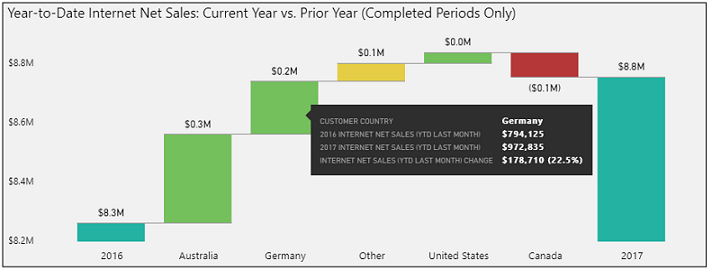
In this example, a YTD sales measure is used for the Y axis input, the calendar year column is used for the category input, and the customer country column is used for the breakdown input. In the formatting pane, the sentiment colors have been left at the defaults (green up, red down) and the max breakdowns property has been set to 4.
Per the image, hovering over the green bar for Germany displays the sales for last year, this year, and the variance and %. Optionally, additional measures could be added to the Tooltips field well to provide even more context.
Wrapping Up
There are many other ways of finding and visualizing a variance but the waterfall chart naturally tells an intuitive story and calls out the main drivers (breakdowns). If you needed the details of every country, even those with smaller variances built into the ‘Other’ group, you can always use the Export data feature (ellipsis in top right corner). Additionally, you may not have the variance and variance % measures needed in your dataset and thus the built-in Waterfall tooltips account for this.
Two more details: Date Filter and YTD Completed Meassure
A page level filter on a custom Calendar Year Status column was used in the example above. This date table column was filtered for the two values “Current Calendar Year” and “Prior Calendar Year”. You wouldn’t be able to define this specific filter condition with relative date filters. (My books provide some details on creating dynamic date columns via SQL and M).
The YTD Last Month DAX measure is defined as follows:
Internet Net Sales (YTD Last Month) =
CALCULATE([Internet Net Sales],
FILTER(ALL('Date'),'Date'[Calendar Year] = MAX('Date'[Calendar Year]) &&
'Date'[Date] <= MAX('Date'[Date]) &&
'Date'[Calendar Month Number] <= [Prior Calendar Month Number]))
The standard practice with date intelligence measures is applied (a) remove date filter, b) set column(s) to a value in the filter context). The only difference with this measure is that the calendar month number column is filtered by a measure – the prior calendar month number measure. This measure simply retrieves the prior calendar month (e.g. 10 for October):
Prior Calendar Month Number =
LOOKUPVALUE('Date'[Calendar Month Number],'Date'[Date],TODAY())-1
You typically use a sequentially increasing monthly or period column for applying date logic (e.g. trailing 6) such that you can reference across years. Without going into further detail, for this visual (as constructed), the waterfall chart would be empty in January 2018 since it would display the years 2018 and 2017 but there wouldn’t be a completed month available until February. This could be handled a number of ways but it’s outside the scope of this post.

One comment