Chiclet Slicer
The Chiclet Slicer custom visual, developed by Microsoft, has been around for over two years and is well known for the additional formatting properties it provides report authors such as the number of rows/columns of chiclets and the embedding of images.
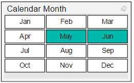
A simple example is the horizontal orientation of calendar months across four rows:
Cross Highlighting
In addition to formatting, support for cross highlighting enables chiclet slicers to also generate insights. For example, a user selection on a particular bar or column from a visual will result in chiclet items unrelated to the given filter context being displayed with a different format.
The Scenario: Global Online and Reseller Sales
Adventure Works sells products online to customers directly and through resellers globally. Naturally, the business needs to compare common dimensions (Products, Promotions, Sales Territories) across the fact tables representing these two business processes. Common questions could be “What are we selling online but not to resellers?” or “Which products are we not selling in Canada?”
Cross Highlighting per Fact Table
In this example we use two Chiclet slicer visuals based on the Sales Country column. The only difference between the slicers is the measure used in the Values field well. Specifically, the left slicer uses Internet Sales Rows and the right slicer uses Reseller Sales Rows. Text boxes are placed below the slicers advising which fact table the cross highlighting represents.
These two measures are simple COUNTROWS() DAX expressions against the given fact table. The other visual is a simple stacked column chart of sales by promotion type.
With no filter selections it appears pointless (or even crazy) to have two slicers of the same column for a given report page. It’s when you start interacting with other visuals that cross highlighting starts to reveal relationships and/or exceptions (ie the disabled chiclets (red) versus the other chiclets).
Insights via Chiclet Cross Highlighting
The user is interested in volume discount promotions and thus clicks this component of the month columns. See the images in the above slideshow for the following three filter contexts:
- May 2017:
- Australia and France didn’t use any volume discounts to sell to resellers for this month.
- All countries used volume discounts to sell products online for this month.
- June 2017:
- Canada and Germany didn’t use any volume discounts to sell products online for this month.
- All countries used volume discounts to sell to resellers for this month.
- June and July of 2017:
- Only Canada didn’t use any volume discounts to sell products online in either June or July of 2017.
- All countries used volume discounts to sell products to resellers in either June or July of 2017.
Wrapping Up
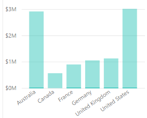
The cross highlighting for the Chiclet slicer called attention to the missing dimension members in an intuitive way. The highlight visual interaction available to several other visuals isn’t as transparent. For example, you have to focus (squint) on the chart below to determine that Canada doesn’t have any sales:
Next Week’s Blog
The plan is to revisit SSAS Tabular 2017 next week. Specifically, we’ll look at the process of modifying a partitioned fact table (ie adding a column) and we may review detail row expressions too.

I wanted something like this so I tried using chiclet slicer but I am not able to cross-highlight. when I select the category instead of cross-highlighting, my data is filtered completely. Can you please guide me in how you made cross-highlight possible using the slicer?
Thanks,
Akshay Patel
LikeLike
Hi Akshay,
Cross-highlighting via the Chiclet Slicer requires the use of the Values field well, the field well immediately below the Category field well. Per the blog post, I created simple COUNTROWS() DAX measures for the fact tables involved and then applied these measures to the Values field well. One other item to check is the Edit Interactions on the Format tab of Report View. With Edit Interactions enabled, you can select the other charts/visuals on the page and see if they’re set to Filter, Highlight, or None for the Chiclet slicer. Hope this helps. -Brett
LikeLike
Thankks for posting this
LikeLike