Since last week’s episode of Insight Quest, a primary business stakeholder has reached out to Anna, the BI team manager, and asked if they could ‘see something’. Anna respectfully reiterated that the team has been focused on the fundamentals of the solution such as the data model, row-level security, and the DAX metrics but nonetheless agreed to offer a sneak preview of some of the business-facing Power BI content being developed.
Anna called a meeting with Mary, the team’s visualization and report designer, and Brett, the dataset designer, and the team decided to present the following three features:
You might think that the dataset designer isn’t needed for a data visualization/exploration oriented demo but in many cases, especially early in projects, some level of data modeling, DAX, and/or M is often required to effectively demonstrate top report features.
A bit of context…
If you haven’t been reading this blog, the business stakeholders in this case are the coaching staff for an American college football team. As a physically demanding sport, the staff is interested in athletic testing and body composition statistics on the team’s players such as which players are lowering their body fat percentages and which players are gaining strength relative to goals/plans set for each player as well as relative to other players at the same position. These insights could drive decisions such as when to change training techniques and/or nutrition programs and which players to focus their efforts on.
The content in the demo/preview and the initial Power BI App of reports and dashboards deployed to production should reflect these priorities.
Report Tooltip Page
Even standard tooltips, which have been available for years, are a great way to easily enhance visuals with additional context. Originally I was concerned that adding tooltip fields would negatively impact performance but note that one of the ‘Super DAX’ features built into the Analysis Services Tabular 2016 (1200 Compatibility Level) release is Measure Fusion which combines measures from the same table into a single storage engine query.
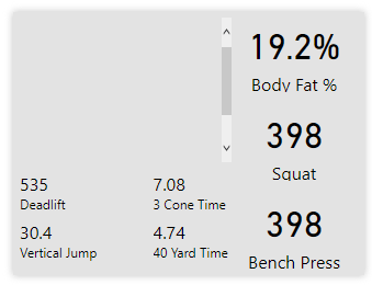
Report tooltip pages take tooltips to a whole new level by enabling the author to provide a small report (page) within a report and contextual for the given field being hovered over. In the following example, a tooltip page uses a player image field and Card and Multi-Row card visuals to provide rich supporting context when the user hovers over the Player field in a table:

Per the image above, as the user hovers over the player field, a report page tooltip appears with statistics specific to the given player. In this case, the most critical metrics (body fat %, Squat and Bench Press) are assigned to Card visuals on the right while a multi-row card provides four additional metrics below the image.
The official documentation on report tooltip pages and the monthly Power BI Desktop videos covers all the essentials in setting up this behavior. To display the image, there’s an image URL field in the player dimension table and a DAX measure, which is set to the Image URL Data Category, is used to retrieve this value via the SELECTEDVALUE() function. This DAX measure is added to a table visual and the Image height property in the Grid formatting card is set to a value of 150. Finally, the column header font color is set to match the background color to keep this invisible to the user)
The tooltip page is hidden in the report and the Page View size is set to Actual Size as recommended in the documentation:
*Note: For this iteration (a preview), the scrollbar cannot be hidden. In an actual deployment, the scrollbar would be removed. The image is blank on the tooltip page because there’s not a single player in the filter context.
Drillthrough Report Page
Drillthrough report pages are always a great candidate for demonstrations with business users and earlier this year they were enhanced to reflect the filter context of the source page. In the following example, Mary, the report designer, has created a drillthrough report page which also targets an individual player’s athletic performance statistics:
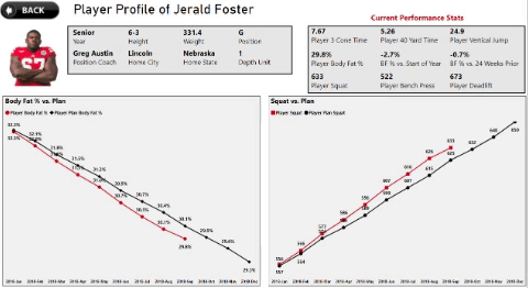
Per the above images, the drillthrough page provides both high level and current state statistics as well as two line charts to compare body fat % and squat versus their respective plan values. The drillthrough page is intentionally not filtered to allow the user to see the Plan values for the remainder of the year and, though not shown, the user can also drill down from months to weeks for additional details.
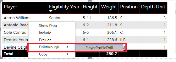
The drillthrough functionality itself is simply a matter of adding the intended field to the drillthrough field well per the following image:

Once created, other visuals in the report which use the Player Name field from the Player dimension table will have access to the drillthrough page:
The drillthrough report page uses a table to display the player’s image similar to the tooltip page and uses two rectangle shapes to provide the background and border for the top two sets of metrics. Like the tooltip report page, the image height property of the Grid formatting pane is set to 150 to enlarge the size of the image.
Notice also that the line charts distinguish actual versus plan via both color (red vs. black) and different shape types. So if the user doesn’t visually perceive colors well, the shapes and data labels can help distinguish the two series.
The title of the report page (“Player Profile of…”) is just the concatenation of a DAX measure which retrieves the value from the Player Name column and a text string:
PlayerProfileDrillMessage = "Player Profile of " & [Player Name Selected]
Finally, in order to display the name of the player’s position coach, a DAX measure was written to retrieve the coach’s name and, for this measure only, enable bi-directional crossfiltering between the Players and Coaches tables:
Selected Position Coach =
CALCULATE(
   SELECTEDVALUE('Coaches'[Coach Name]),
       CROSSFILTER('Players'[Player CoachID],Coaches[CoachID],Both))
Per last week’s post, the Coaches table has a one-to-many relationship to the Players table with Single direction cross-filtering. Thus, when the drillthrough page is filtered by the given player, it’s necessary to use CROSSFILTER to propagate this filter context to the Coaches table.
Expression-based Formatting
The final feature for the preview uses a DAX measure to return one of three colors (Red, Yellow, Green) for a given player based on his body fat % relative to thresholds for his given position. For example, an offensive line player is expected to carry a higher body fat % than a wide receiver and thus it’s necessary to embed this position-specific logic into an expression that can dynamically determine which position is active in the filter context.
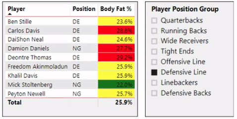
In a report visual containing multiple players from different positions, the conditional logic applies formatting based on thresholds specific to the given player’s position group. In the above example, 22% is actually ‘good’ for a Defensive Line player (green) but much lower body fat % values are actually bad for the Running Back and Wide Receiver positions and thus flagged as red.
Similar to the prior post on this feature, the DAX measure driving the background color uses variables, SWITCH and IF conditional logic, and HASONEVALUE to detect if a single member of the given dimension is in the filter context:
BF % Conditional Expression =
VAR SinglePlayerCheck = HASONEVALUE('Players'[Player Natural Key])
VAR PositionGroup = VALUES('Players'[Player Position Group])
VAR GoodColor = "#008000" //Green
VAR MediumColor = "#FFFF00" //Yellow
VAR BadColor = "#FF0000" //Red
RETURN
SWITCH(TRUE,
    SinglePlayerCheck = FALSE(),BLANK(),
    PositionGroup = "Offensive Line",
        IF([Player Body Fat %] <= .265, GoodColor,IF([Player Body Fat %] >= .275,BadColor,MediumColor)),
    PositionGroup = "Defensive Line",
        IF([Player Body Fat %] <= .23, GoodColor,IF([Player Body Fat %] >= .26,BadColor,MediumColor)),
    PositionGroup = "Defensive Backs",
        IF([Player Body Fat %] <= .125, GoodColor,IF([Player Body Fat %] >= .135,BadColor,MediumColor)),
    PositionGroup = "Linebackers",
        IF([Player Body Fat %] <= .15, GoodColor,IF([Player Body Fat %] >= .16,BadColor,MediumColor)),
    PositionGroup = "Quarterbacks",
        IF([Player Body Fat %] <= .15, GoodColor,IF([Player Body Fat %] >= .17,BadColor,MediumColor)),
    PositionGroup = "Running Backs",
        IF([Player Body Fat %] <= .136, GoodColor,IF([Player Body Fat %] >= .142,BadColor,MediumColor)),
    PositionGroup = "Wide Receivers",
        IF([Player Body Fat %] <= .12, GoodColor,IF([Player Body Fat %] >= .128,BadColor,MediumColor)),
     PositionGroup = "Tight Ends",
        IF([Player Body Fat %] <= .145, GoodColor,IF([Player Body Fat %] >= .155,BadColor,MediumColor)),
        BLANK())
The Player Body Fat % measure referenced in the expression follows the same semi-additive pattern described last week with the LASTNONBLANK() function.
The background color conditional formatting dialog for the Body Fat % metric in the table visual simply references the conditional expression (BF % Conditional Expression) :

Note the Format by Field value dropdown.
Wrapping Up: Back in November
The bad news is that this is very likely the last post until November. The good news is that A) presentations at Power BI World Tour Seattle and SQL Saturday Lincoln will be packed with demo/example content that I hope attendees find interesting and B) recent conversations suggest that a new Microsoft business intelligence book could be targeted for late 2019 or early 2020.

Instead of hard-coding all of those percentages based on position, is it possible to use a table\file with value pairs?
LikeLike
Hi Duncan,
Yes, it’s definitely possible, and it’s probably the right long term decision if you think you’re going to be re-using the percentages in other scenarios. You would create or load a table with three columns (Position, High, Low) and a row for each position. You would hide this table and then create DAX measures which retrieve the individual threshold values such as Quarter Back High BF % = CALCULATE(MAX(MyTable[High]),MyTable[Position] = “Quarterback”). Finally, you’d just hide these measure expressions and reference them in your conditional formatting expression.
So it’s a little bit more work and now your data model would have another table and more measures but, to your point, the hard coding would be eliminated and you could centrally manage the source table such that any revisions would flow to your formatting expressions. (For this blog post, since we’re just talking about a preview/proof-of-concept to show the business, a dedicated table would be a bit too heavy).
LikeLike