The August 2018 release of the Power BI Desktop adds expression-based conditional formatting rules to the conditional formatting options available for table and matrix visuals. As this is a generally available feature (not a preview feature like Composite Models), I assume many Power BI report authors and users will be interested in enhancing their reports to support more complex and dynamic business logic.
In this blog post I’ll walk through an example of developing background and font color formatting expressions based on the product category of an individual product and applying these formatting expressions to a table visual. In a future post, potentially as early as next week, I’ll explore utilizing expression-based formatting with Cards, Bookmarks, and Buttons to support a more app-like user experience.
Based on guidance at the Business Applications Summit, other properties of Power BI reports will support expression-based (dynamic) formatting in the future. If you’re familiar with paginated reports from SQL Server Reporting Services (SSRS) or the Power BI Report Server, which will also be supported in the Power BI service soon, then you’re likely aware that robust support for expressions is very important for driving more powerful and intuitive reporting solutions.
Distinct Formatting by Product Category
Like many real-life businesses, there are multiple sales channels in the AdventureWorks sample database and these sales channels (Internet Sales, Reseller Sales) have very different profit margins across product categories per the following table:
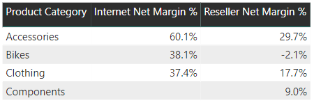
For the conditional formatting to be useful, therefore, it needs to be specific to the given product category and sales channel. For example, you typically wouldn’t want to call attention to the value 60.1% if this value is associated with online sales of an Accessories product as this is the expected or normal value for the entire category when sold online. A 60.1% margin rate for a product from the Bikes category, however, would definitely be a good candidate for formatting.
Step 1: Conditional Formatting Requirements
Ideally the consumers of the report or representative(s) of this group have a clear understanding of the thresholds. If you’re lucky, a power user has already built conditional formatting rules into an Excel-based report or maybe a BI developer has built expressions into an SSRS/paginated report. The point is that before you invest much effort into the DAX expressions, you want to try to at least get a starting point or reasonable estimate of the logic to implement in the initial iteration. If you’ve developed efficiently and captured the essential structure of the logic correctly, you may only need to tweak a few variable values in future iterations.
It’s often easier to obtain requirements if you have something to show so if no business input is available you could quickly create a sample report in a dev/test environment based on an educated guess and review this with the business user(s).
In this example, we want to target the internet sales channel first and we want formatting thresholds that align with the distribution of margin % values by category. For example, the upper and lower boundary interval for Bikes should be plus or minus 4% relative to the Bikes category rate while the boundary interval for Clothing products, which are more widely distributed across product categories, should be plus or minus 10% relative to the Clothing category rate.
From a visualization perspective, for this simple example we want three possible background colors (Green, Red, and White) and two possible font colors (White and Gray). High and low values (the exception products) will be assigned Green and Red background colors, respectively, as well as White font colors to help these values stand out. Values which don’t fall outside the thresholds, will be assigned a White background with a standard Gray font such that these values don’t stand out.
Of course you may need or want more formats reflecting more conditions. In a slightly more advanced scenario, you could make your interval boundary dynamic such that the +-4% for Bikes is replaced with an expression itself that computes the interval value for the given filter context of the report.
Step 2: Write the Background Color Measure
With your requirements known (and preferably documented), you can write a DAX measure in the source Power BI dataset or Analysis Services Tabular model for the report that returns a text value such as a Hex code (“#008000”) or the name of a specific color (“Green”). DAX variables can be used to make the logic as flexible and readable as possible.
If your report uses a live connection to a Power BI dataset or an Analysis Services Tabular model, you could also create this formatting measure specific to the given report (report-level measures). However, like almost all measures, you’ll probably want to centralize this logic back in the source dataset or Analysis Services Tabular model to drive consistent results and behaviors across many reports.
In the following example, three variables are used to store the internet net margin rates (1 per category) and three more variables are used to store the boundary intervals for each category. Additionally, three color values (hex codes in this example) are also stored as variables.
A variable is also used to determine if a single product (one business key) is in the filter context. Finally, the internet net margin % measure is assigned to a variable to avoid unnecessary queries being generated given the multiple conditions being tested. (In measures with multiple IF/SWITCH conditions that refer to the same measures or expressions, you can often boost performance by storing this expression in a variable such that the value is only computed once)
These eleven (11) variables are then passed into a SWITCH function, which includes three additional SWITCH functions (1 per category), that applies the logic for a specific product (a single business key).
Internet Net Margin % (CF Background) =
VAR ClothingOnlineMargin =
  CALCULATE([Internet Net Margin %], FILTER(ALL('Product'),'Product'[Product Category] = "Clothing"))
VAR BikesOnlineMargin =
  CALCULATE([Internet Net Margin %], FILTER(ALL('Product'),'Product'[Product Category] = "Bikes"))
VAR AccessoriesOnlineMargin =
  CALCULATE([Internet Net Margin %], FILTER(ALL('Product'),'Product'[Product Category] = "Accessories"))
VAR SingleProductCheck = HASONEVALUE('Product'[Product Alternate Key])
VAR InternetNetMargin = [Internet Net Margin %]
VAR ClothingBoundaryInterval = .1
VAR BikesBoundaryInterval = .04
VAR AccessoriesBoundayInteval = .07
VAR HighFormatColor = "#008000" //Green
VAR LowFormatColor = "#FF0000" //Red
VAR NeutralFormatColor = "FFFFFF" //White
RETURN
SWITCH(TRUE(),
    SingleProductCheck = FALSE(), NeutralFormatColor,
    //Clothing logic
    VALUES('Product'[Product Category]) = "Clothing",
        SWITCH(TRUE(), InternetNetMargin >= ClothingOnlineMargin + ClothingBoundaryInterval,HighFormatColor,
                       InternetNetMargin <= ClothingOnlineMargin - ClothingBoundaryInterval,LowFormatColor,
                            NeutralFormatColor),
    //Bikes logic
    VALUES('Product'[Product Category]) = "Bikes",
        SWITCH(TRUE(), InternetNetMargin >= BikesOnlineMargin + BikesBoundaryInterval,HighFormatColor,
                       InternetNetMargin <= BikesOnlineMargin - BikesBoundaryInterval,LowFormatColor,
                            NeutralFormatColor),
    //Accessories logic
    VALUES('Product'[Product Category]) = "Accessories",
        SWITCH(TRUE(), InternetNetMargin >= AccessoriesOnlineMargin + AccessoriesBoundayInteval,HighFormatColor,
                       InternetNetMargin <= AccessoriesOnlineMargin - AccessoriesBoundayInteval,LowFormatColor,
                            NeutralFormatColor),
    NeutralFormatColor)
Notice that the product category margin variables use the ALL() function to remove the current filters from the Product table. Without this function, the variable would return the margin rate for the given product in the cell being evaluated and thus no products would be formatted as green or red. The first condition or ‘Value’ of the SWITCH handles filter contexts with multiple products by returning the neutral color (White). The subsequent three conditions (Values) apply formatting specific to a given single product within a product category.
It’s also important to note that filters applied on other tables such as the Date table will be accounted for by the expression. For example, without any filter on Date, the Bike thresholds will be 34.1% and 42.1% since this rate is 38.1%. The Bikes rate for the year 2017, however, is 37.7% and thus the formatting thresholds applied will be 33.7% and 41.7% if/when the year 2017 year is in the filter context. In this sense, the expression is dynamic – the formatting thresholds will adjust according to the changing filter selections by the report author and/or users. An example of this is provided at the end of Step #5.
Step 3: Write the Font Color Measure
As mentioned in Step #1, we want a White font color for the exception values (high or low) and a Gray font color (#333333) for the normal/expected values. Therefore, we need a separate DAX measure to return either White or Gray (via hex code or color name) to drive the font formatting.
This measure will have the same structure and general syntax to to the background color measure in Step #2 but will replace the three color variables with two color variables and then pass these variables to the SWITCH(). Given the similarity to the background color measure , I’ll just show a small portion of the font formatting measure here:
VAR InternetNetMargin = [Internet Net Margin %]
VAR ExceptionFormatColor = "#FFFFFF" //White
VAR NeutralFormatColor = "#333333" //Gray
RETURN
SWITCH(TRUE(),
    SingleProductCheck = FALSE(), NeutralFormatColor,
    //Clothing logic
    VALUES('Product'[Product Category]) = "Clothing",
        SWITCH(TRUE(), InternetNetMargin >= ClothingOnlineMargin + ClothingBoundaryInterval,ExceptionFormatColor,
                       InternetNetMargin <= ClothingOnlineMargin - ClothingBoundaryInterval,ExceptionFormatColor,
                            NeutralFormatColor),
Per the Clothing logic condition within the SWITCH, values above and below the threshold values receive the same color (White) – the color stored in the ExceptionFormatColor variable. Values within the thresholds will receive the default Gray font color.
Step 4: Apply the Formatting to the Table/Matrix Visual
The ‘heavy lifting’ has been done at this point. Now you simply need to create a table or matrix visual and associate the measures created in Steps 2 and 3 to the field which you want to format. In this case, a table visual is created with the product name and product category fields and the Internet Net Margin % measure. For this visual we’ll only format the measure values but be advised that you absolutely could format the product name and/or product category fields by the formatting expressions too if you wanted. (In general I try to minimize the use of strong colors to avoid overwhelming the user.)
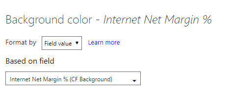
You can click the dropdown for the Internet Net Margin % field in the Values bucket to open the Conditional formatting dialog for Background color. You’ll then specify the ‘Format by’ option to be ‘Field value’ and choose the expression measure you created for background color formatting (Step #2 measure) as follows:
Repeat this same process for font color conditional formatting but choose the measure you created for font colors in Step #3.
Step 5: Test and Review the Visuals
In the following table visual, two products from the clothing category are formatted (background of Red or Green, font is White) given that their margin rates are beyond the 10% interval boundaries for the Clothing category rate. The accessories product is not formatted (white background, gray font) since 60.1% is within the interval boundary for Accessories. Finally, three bike products are all formatted differently given the lower and upper boundaries of 34.1% and 42.1%, respectively.
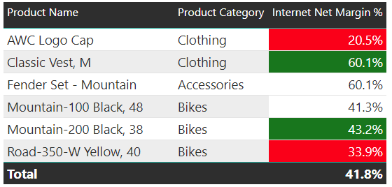
The Product Category field doesn’t have to be on the table visual, of course. The Product Name field could also be replaced with the business key field (Product Alternate Key) if that’s all you needed or added to the table. The Product Name and Product Category fields are included in this example just to make it easier to understand what is going on with the formatting.
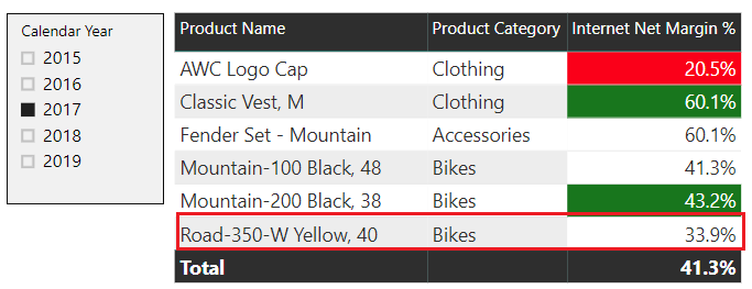
Again, with this approach the threshhold/boundary values will respect filters applied in the report from other tables such as Date or Promotion. So if you get unexpected results, you’ll want to check what filters have been applied (e.g. slicers, report/page/visual level filters) and use this information to determine what thresholds were applied given this context. Maybe your margins or whichever metric you’re using are very different given a certain filter (e.g. Promotion = Discontinued Product) and thus the formatting reflects this context.
For example, the Road 350 product was still at 33.9% in the year 2017 but, given lower bike margins in 2017, it’s no longer outside the thresholds in this filter context and thus is not formatted with Red background White font:
As you may know, and as described in a past blog, you can definitely take advantage of table/matrix conditional formatting for Card visuals. I’d like to write an updated post on conditional card visual formatting (inclusive of buttons and bookmarks) at some point in the near future. For example, you could let a user choose whether to apply conditional formatting based on profitability or sales growth.
In most scenarios you should probably hide your conditional formatting measures from the user interface once they’ve already been applied to the given visuals such that users don’t see these measures in the Fields list. Just remember that you’ll need to temporarily unhide these measures when you need to apply them to new visuals. Similar to other user interfaces in other tools, the conditional formatting user interface does not provide access to hidden measures.
Wrapping Up
So with the August 2018 release of Power BI Desktop, conditional formatting is no longer limited to relatively simple and hard coded/static rules you define in the conditional formatting user interface. With a little (or potentially not so little) DAX expression logic, you can embed rich business logic to help users more quickly gain insight from the data being analyzed.
I’m sure many expression-based formatting examples will be available from other sources (other blogs, PBI docs) but hopefully this at least introduces you to the feature. Currently the plan for next week is to integrate bookmarks and buttons with expression-based conditional formatting. You may consider subscribing to this blog to get notified when future posts are published.

2 comments